Accessibility – breaking down barriers
Since 2018 it’s been a legal requirement for all publicly funded sites to meet WCAG AA standards. This was important for 10 Degrees as we have many clients in the public sector. Some may have seen this as a barrier but we saw it as an opportunity and now it’s widely accepted that meeting these standards is a minimum requirement for all sites, not just those in the public sector, or those who are blind or visually impaired, deaf or have hearing difficulties, but for everyone.
WCAG, or Web Content Accessibility Guidelines for its full name, are an internationally recognised set of recommendations for improving accessibility on websites, developed by the World Wide Web Consortium (W3C) Web Accessibility Initiative (WAI).
There are a three levels of conformance which are:
- Level A which is the minimum level
- Level AA which includes all Level A and AA requirements
- Level AAA which includes all Level A, AA, and AAA requirement
Level AA is our minimum requirement but where possible we strive for AAA.
Working to make every digital product we create accessible meant that every member of the team had to adapt our daily lives. Not just designers and developers but those involved in the first conversations of a new project, the project manager and our client support team all communicate and work on things related to accessibility.
What are the ‘barriers’?
Making such an adjustment to everyone’s daily work life can, at first, seem like a barrier. However, of course they’re not, they’re small adjustments that over time become second nature.
Here are some of those adjustments:
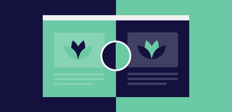
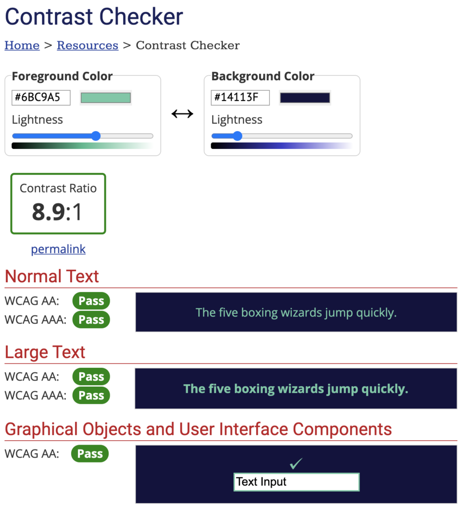
- Colour contrasts
As a designer, by far the biggest change to my daily life was inputting foreground and background hex codes into an online contrast checker. This was, and still is, a heartbreaking process when you discover that a colour combination that ‘pops’ (sorry, I won’t say that again) isn’t compatible and it’s back to the drawing board.
- Minimum font sizes
This is an easy one. There’s no minimum font size requirement but as a rule we go no smaller than 16px for body text. The exception to this would be for secondary information like the copyright info a footer, for example.
Bigger mobile screens have made this easier to keep consistent between desktop and mobile devices as 16px or 18px body text no longer looks insanely big on a 480px screen and therefore you can keep your style guide the same, rather than having a size for mobile and a size for desktop. - Focus states
Defining hover states is part of the fun of being a digital designer as this is an area in which you can show how your designs come to life in a dev environment, rather than flat images synced up to a prototyping tool. Buttons and links are a key component and you’ll need to include focus states within your style guide for keyboard users.
What are the opportunities?
- Brand development
The heartbreak I mentioned above when you’re denied some text in a particular colour appearing on a background colour is actually an opportunity to work with your client on some brand development.
There’s been some interesting conversations when I’ve discovered a primary colour isn’t accessible on a white background, but there’s always a solution. If a primary colour is a major piece of their brand equity, it can be tweaked slightly to ensure there’s enough of a ratio to be compliant. It may not be ideal but it could open up a wider conversation and lead to developing a new, or adjusted colour palette. - Empathy
By making these small changes to our approach and processes, we’re making websites more inclusive and a better experience for those with disabilities. This is important to us as empathy is one of our core values and we believe everyone should enjoy the great digital products we create. - Becoming a better UX designer
By doing all of the above I’ve naturally become a better UX designer. Now I consider all users in every part of my process. My style guides are more comprehensive and I can be confident when delivering a project that I’ve made it a good experience for everyone. - New audiences
Now it’s widely accepted that being WCAG AA compliant is better for all websites and not just those in the public sector, you could be opening up a new audience.
Summary
There’s a lot I haven’t touched on here, like including alt tags on images and having a more accessible site will impact favourably in SEO and readability of your code, for example. I’ve highlighted some below but there’s a comprehensive list on the gov.uk website.
- Provide transcripts for audio and video
- Captions for video
- Don’t use colour as the only way to explain or distinguish something, like an error message on a form submission, for example
- Make sure your service works well with assistive technologies – for example, important messages are marked up in a way that the screen readers knows they’re important
- Don’t use words and phrases that people won’t recognise – or provide an explanation if you can’t avoid it
A lot of these things can’t be seen on the surface but that doesn’t mean they’ll go unnoticed, some users will really appreciate the extra work to make it a better experience for them. So, to wrap up, the take home message is that by adopting these small steps in each stage of your process isn’t a barrier, it’s an opportunity to create better things.
The Author
Jonny Vaughan
Founder & Technical Director of 10 Degrees. Jonny's day to day focus is on determining the best technical solutions for our clients, driving technical innovation and leading our sustainability agenda.
The 10 Degrees Team